WORLDWIDE
shipping
NEW STYLES JUST IN
ABOUT THE PROJECT
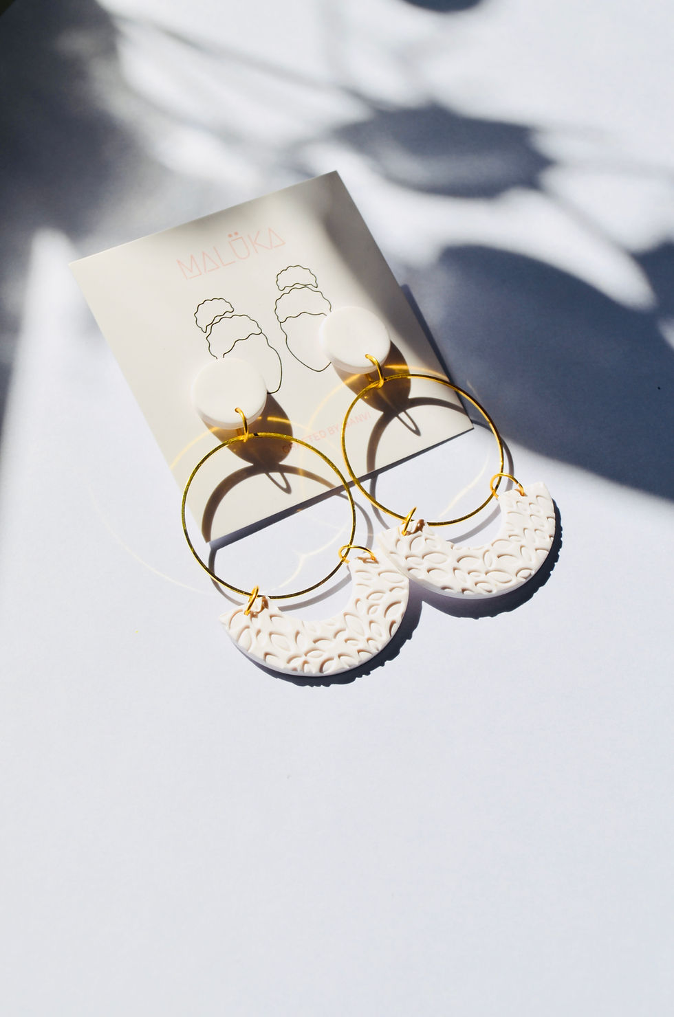
Maluka
Maluka was born out of a personal challenge, finding jewelry that didn’t irritate my skin. What began as a few handcrafted prototypes quickly turned into a full-fledged e-commerce venture. I built Maluka end-to-end: from brand identity and UX flows to product design, logistics, and customer experience.
Over 1,600 orders fulfilled | $5,000 in revenue | 92% positive feedback | 27% increase in organic traffic
ROLE
USER RESEARCH
USER DESIGN
VISUAL DESIGN
PRODUCT DESIGN
ECOMMERCE
SOCIAL MEDIA MARKETING
TYPE
BUSINESS | FOUNDER
TOOLS USED
FIGMA
WIX
GOOGLE SUITE

PROBLEM STATEMENT
Problem
statement
Most affordable fashion jewelry is not designed with sensitive skin in mind. Women with metal allergies or skin sensitivities often have to choose between looking good or feeling comfortable.
This underserved audience faces:
-
Allergic reactions in daily wear
-
Lack of product labeling and transparency
-
Limited access to stylish, safe alternatives
The result? A compromise between confidence, comfort, and creativity especially in social, professional, and festive settings.
SOLUTION
Comfort Meets Creativity
Maluka offers a hypoallergenic accessory line that redefines fashion for sensitive skin.
What started as handcrafted designs evolved into a mini-D2C brand powered by design thinking and user research.
What I built:
-
Handcrafted, polymer-based jewelry optimized for low skin reactivity
-
A user-tested e-commerce platform (Wix + Figma wireframes) with mobile-first design
-
Brand identity that blends elegance + approachability
-
Content strategy to position Maluka as a personal, thoughtful, and safe choice
-
Order, packaging, and fulfillment systems scaled to 1,600+ deliveries
Results:
-
91% users validated comfort + style combo
-
$12,000 revenue in 6 months (bootstrapped)
-
27% organic traffic growth via SEO and Instagram
RESEARCH METHODS
Sensitivity
Dilemma
I conducted comprehensive user research to understand the nuanced challenges faced by women with ear sensitivities:
Competitive Analysis: Examined 15 existing jewelry brands marketed for sensitive ears, evaluating their materials, design variety, pricing strategies, and customer sentiment
Qualitative Interviews: Engaged with 25 women experiencing various levels of ear sensitivity through in-depth conversations to capture detailed personal experiences.
Material Testing: Evaluated 8 different materials for weight, allergenicity, durability, and design versatility through controlled wear tests.


KEY INSIGHTS
User pain points identified
Physical discomfort extends beyond immediate irritation to anxiety about wearing jewelry in important settings.
Style limitations create emotional impact, affecting self-confidence and sense of personal expression.
Price-to-design ratio significantly higher for hypoallergenic options, creating financial barriers.
Limited awareness about material alternatives beyond traditional metals.
Market Gap Validation
82%
reported abandoning earrings they loved due to discomfort
76%
expressed dissatisfaction with the design variety available in sensitive-ear jewelry
91%
valued both comfort and style equally, refusing to compromise either
86%
were willing to try non-traditional materials if comfort could be guaranteed
Material Assessment Outcomes
Polymer clay emerged as the optimal medium due to its lightweight properties, hypoallergenic potential, design flexibility, and cost-effectiveness.
When properly sealed, polymer clay showed zero allergic reactions across test subjects.
Weight comparison showed polymer designs at 60-75% lighter than comparable metal options.

Our mural board snapshot
Material Optimization & Design Philosophy
Based on our research insights, I developed a structured approach to transform polymer clay into premium jewelry solutions.
Material Refinement
Experimented with various polymer clay brands and formulations to identify optimal blends for durability, weight, and finish quality. Established precise baking protocols to ensure consistent structural integrity.
Design Principles
Created a design framework balancing aesthetic appeal with sensitive ear considerations:
-
Weight distribution engineering to prevent pulling on earlobes
-
Strategic thickness variations to maintain strength while minimizing mass
-
Post-production sealing techniques to eliminate potential allergens
-
Fastening systems designed specifically for comfort during extended wear
Technique Development
Mastered specialized polymer techniques including marbling, caning, texture application, and millefiori to enable creative variety without compromising the lightweight requirement.

Textured Surfaces
Created pebbled effects using imprinting tools and custom silicone texture sheets. This versatile technique ensures product consistency while enabling design variety, resulting in multiple bestsellers.

Gradient Texture
Crafted mesmerizing blue-white gradients by blending clay, forming patterns with hand impressions, and reducing canes to optimal thickness. Thin slices are tessellated and rolled to create 360-degree patterned textures.

Color Formulation
Developed precise color formulations for customized bridesmaids' collections, including wine rose, dark rose, and pink rose variations. Careful conditioning through pasta machine settings (6 to 1) ensures consistent texture and finish quality.

Cane Technique
Mastered the art of polymer clay square canes, precisely reduced and sliced to reveal kaleidoscopic patterns with each cut. This technique enables intricate, repeatable designs with exceptional precision.
Production Process Implementation
Established a standardized production workflow to ensure quality consistency while maintaining scalability. This systematic approach to product development created the foundation for a jewelry collection that genuinely addressed the identified market gap delivering both the comfort and style that our research proved users desired.
Quality Control
Implemented a multi-point inspection system with precise weight thresholds, structural integrity tests, and finish quality verification for each piece.
Production Documentation
Created detailed technique guides and design specifications to maintain consistency across production batches.
Efficiency Optimization
Developed batch processing methods that increased production capacity by 35% while reducing material waste.
Material Sourcing
Established relationships with premium polymer clay suppliers to ensure consistent color saturation and working properties.
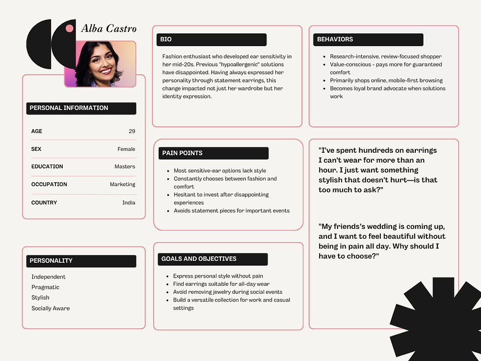
Persona
Translating our product solution into a compelling digital experience required careful planning and implementation.
Created user personas based on research findings to guide navigation and content priorities.
.png)
FIRST LAUNCH
From Findings
to Design
Designed comprehensive wireframes and high-fidelity mockups in Figma before implementation.

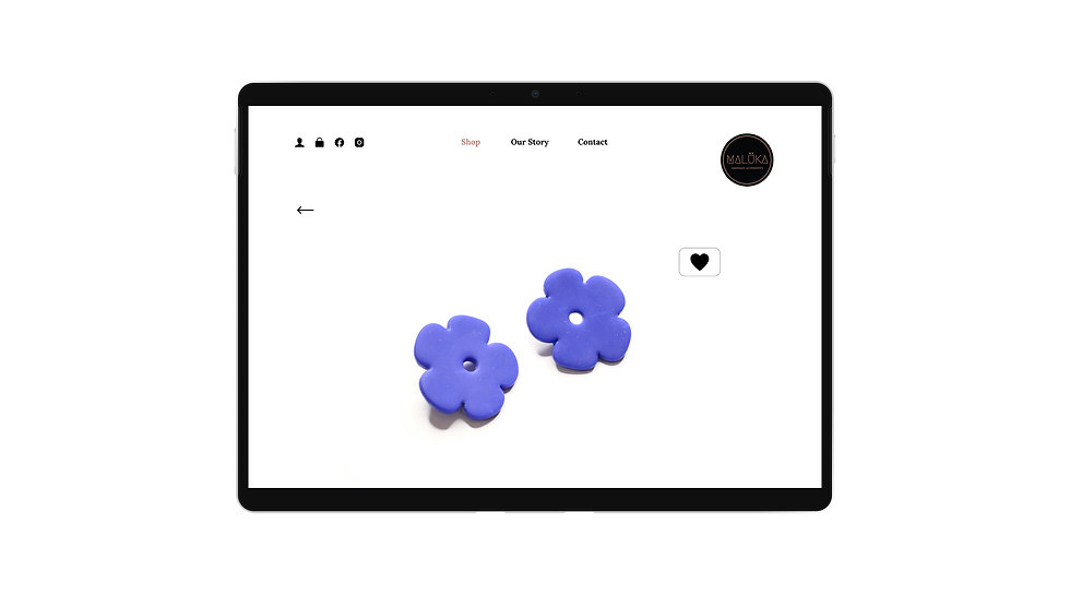
HOMEPAGE

SHOP
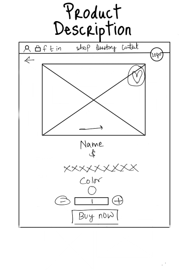
PRODUCT DESCRIPTION

OUR STORY

CONTACT US

SIGN UP
Visual Identity
Maluka establishes a sophisticated yet approachable visual foundation for the brand through thoughtful design elements:
Maluka's logo
TYPOGRAPHY
LORA
Aa123
LORA
Aa123
COLORS
#BD8276
#0D0D0D
#FFFFFF

Brand Identity
HIGH-FIDELITY WEBSITE DESIGN
Maluka handcrafted accessories
Built a High-Fidelity Prototype to enable rapid iteration based on user feedback. Optimized product photography to accurately represent materials and scale.
These high-fidelity prototype were made as user struggled to give feedback of the buying experience and their expectations with low-fi protoype as this was real audience and had difficulty in visualising and following expected UX steps. I wanted to give them a closest experience possible for picky feedback.
User is happy with it, simple
and straight forward.

Some user did not understand how
our brand was different, for them
it was a normal jewellery brand and
what wee exactly offered.
Love actual product picture. It so satisfying and feels personal, excites to buy the product.
A quick drop for categories like new arrival, best sellers, Discounts

Filter price is good, should add type for quick browse.
Confused if this is a different
category or all the products.

Confused about where is
the wishlist, where to go
after hearting the product
Love the clean, minimal layout. It is easy browsing

Approved the product description, mentioning weight would increase the product value.

Users did not realise if they
reached the checkout page,
missed indication of it.

Good for customer feedback.

This page was inspiring and
resonated with users.
Appreciates the brand

This resonated the most, a photo shot with real people and not glased up models.
CONTENT PRIORITY
MVP
I made Feature Prioritization Matrix to simulate the reasoning behind which features went into Maluka e-commerce site. I Made decisions not just by aesthetics, but by value x effort tradeoffs, and are prioritizing MVP features based on real user behaviors and constraints and feedbacks.

USABILITY TESTING
After first Launch
Guerilla Testing: Asked 5 friends (2 designers, 3 general users) to complete a task Buy a pair of earrings you like”
Instagram Feedback: Collected 20+ DMs and poll responses asking “What stopped you from buying?” or “What helped you decide?”
Order Follow-ups: Sent 8 customers short thank-you messages with one question “Was anything confusing or missing on the site?”
Observation: Watched 3 people browse the site and noted behavior patterns (where they paused, scrolled, or clicked hesitantly)
Before

After
Before

After
FINAL PRODUCT
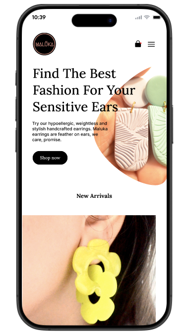
Mobile First
Approach
With over 70% of site visits coming from Instagram and WhatsApp, and keeping the usability test in mind. Maluka’s first launch was intentionally designed with a mobile-first mindset. Users were engaging with our brand directly from their smartphones through story links, bio taps, and tagged posts.
To ensure a smooth, joyful, and fast experience for mobile shoppers, I optimized every part of the experience to load beautifully and work effortlessly on small screens.
Home Page
Replaced carousel with a static hero image and direct CTA after noticing users skipped slides during early tests. Focused on visual clarity and scannable value props.
-
Simplified hero with clear CTA: “Shop Now”
-
Introduced category "New Arrival" upfront
-
CTA button fixed in viewport for quick access
“After this change, time-to-click dropped by 30%, and bounce rate on mobile decreased noticeably (estimated ~12%).”

Menu
The shop option in menu was prioritised based on most common queries during customer DMs (“Do you have studs ?”).
-
Improved product visibility for key styles
-
Increased "Add to Cart" actions for collection-based pages (estimated +18%)
-
Reduced bounce rate on Shop page from mobile (based on click maps + time on page)

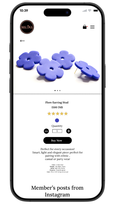
Product Description
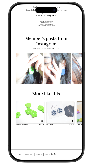
Added lifestyle images and keywords after early visitors dropped off at PDP, SEO improved, and bounce rate dropped by ~12%. Design focused on trust, clarity, and subtle selling.
-
High-res photos with multiple view points (model + product close-up)
-
Description with keywords like "18K gold plated ", "Ultra-lightweight" " Care"

-
"More Like This" recommendation band
-
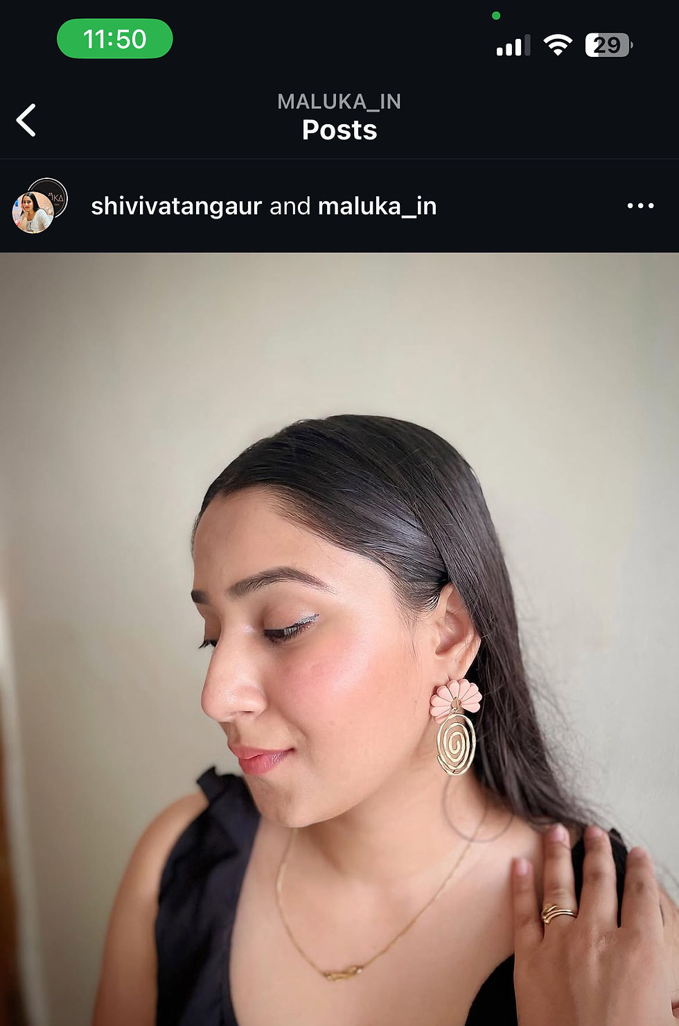
Instagram clickable posts at bottom (UGC for trust)
“Bounce rate dropped from ~48% to ~36% after improving PDP”

“Cart abandonment reduced by ~15% post guest checkout addition”
THE IMPACT
Response
After I launched the improved mobile-first site. Within the first 3 weeks:
-
280+ site visits from Instagram
-
30+ orders placed from mobile
-
92% of users completed checkout without issue
-
Positive messages like:
“The site is so easy to use, I bought it from my phone in like 2 minutes!”
“Loved how clear everything was from photos to checkout!”
Marketing
With a bootstrapped setup and no paid ads during launch, Instagram was our primary growth engine. It became the space where product, brand, and storytelling converged.
Impact:
-
Grew to 9,200+ followers organically
-
25+ tagged unboxing stories from customers
-
Reels generated 4x higher click-through to website than static posts
%20(1).png)

What I learned ?
Focus Beats Breadth
Starting Maluka taught me that solving one specific problem exceptionally well creates stronger customer loyalty than trying to address many needs adequately. By focusing exclusively on comfortable, stylish earrings for sensitive ears, we built a reputation that drove both repeat purchases and referrals.
Data and Empathy Work Together
The most impactful business decisions came from combining customer stories with hard metrics. Listening to women describe their frustrations informed our product design, while analytics guided our marketing spend and inventory decisions.
Start Simple, Improve Quickly
Launching with a small collection of designs and improving based on real feedback proved more effective than delaying for perfection. This approach conserved resources while creating products people actually wanted.
Some Skills Can Wait
I didn't master every aspect of business before starting. Social media management and financial planning were learned progressively as the business grew. What couldn't be delayed was the passion to solve the problem itself.
Let's work together
Reach out at maanvvi05@gmail.com. I have an inbox zero rule so I’ll see your message for sure and, I’ll reply with at least one smiley.